

Not a Square: Josh Harlan’s Minimalist Approach to Data Visualization
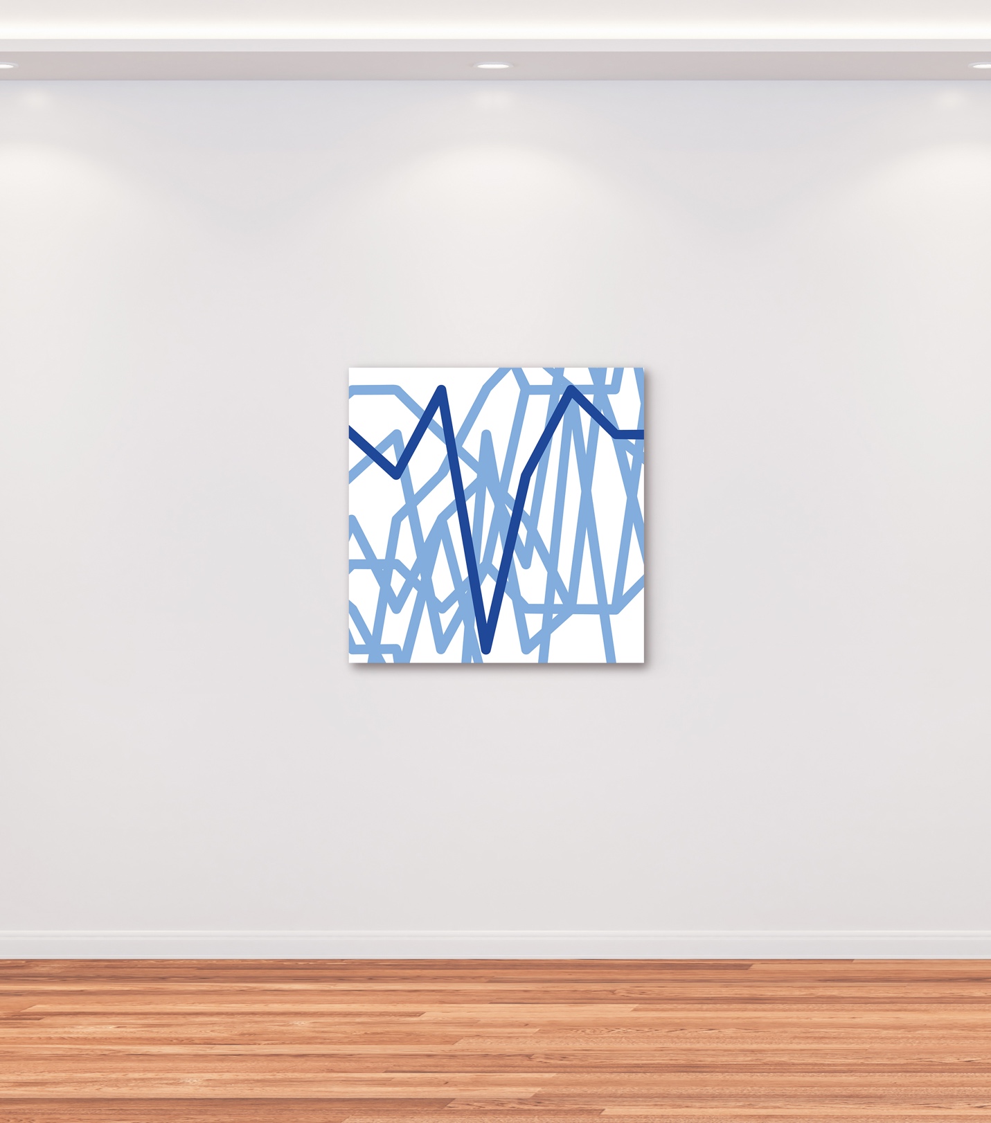
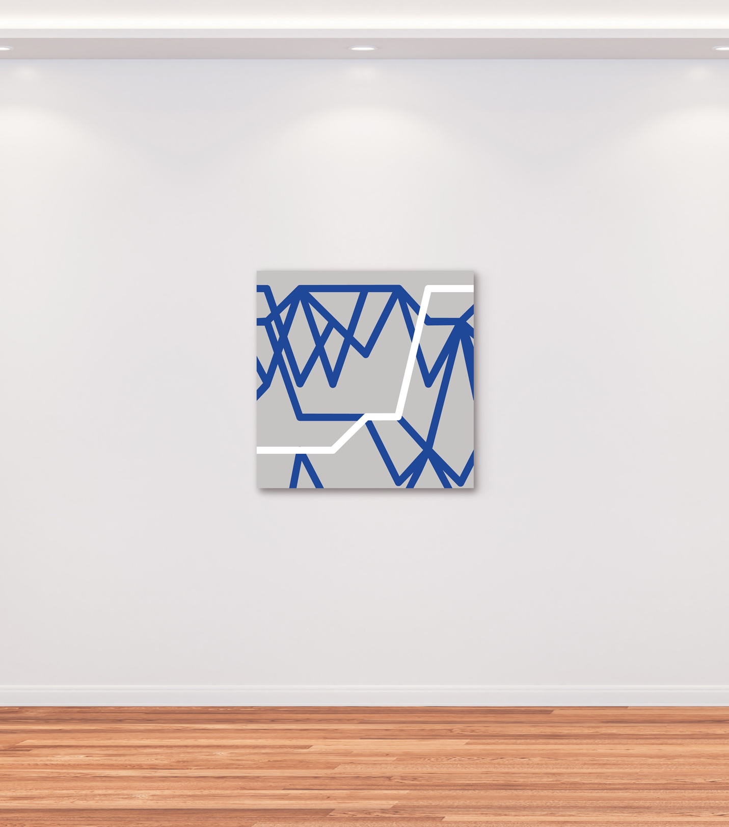
Statistics and data analytics may seem daunting and therefore difficult to question. The artist Josh Harlan centers his work on manipulating data visualizations by merging formal qualities of their design with minimalism, presenting abstractions of statistical data to his viewers. Thus, pointing to the fact that graphic design is an integral component alongside scientific methods of data gathering and analysis to (mis)understand important parts of our society. His work does not say that data analytics are not important, but rather, that we should not shy away from viewing them, or at least be able to identify flaws they might have in presenting universal truths. He digs deeper into these questions of perception in his new series “Lillian” that is based on U.S. university ranking systems. How can the rankings vary to this degree from year to year? “’Arbitrary data sets,” he explains.

Harlan’s work is distinctly modern, not only does he nod to the stripping down of form, inspired by Josef Albers, but it engages with the advent and development of technology—computers, which have facilitated the analysis of data, in addition, to the expansion of telecommunications. His pieces form a meeting of art and technology and that he has shown at East Hampton Library, Palm Beach Cultural Council Biennial as well as in the Contemporary and Digital Art Fair (CADAF), but also tech-companies like Meta are attracted to them, for whom he has worked on a commission.
Together with Cultbytes, he talked about why he has chosen to work with charts and visualizations.
Anna Mikaela Ekstrand: An undertone in your work is the play on legibility and illegibility. At once you base your work on statistical data, yet the outcome is abstract. As a viewer, I understand that the data is there but I cannot make sense of it, there is no key to help viewers link colors or shapes to the properties of the data itself. Why have you chosen to obfuscate the data?
Josh Harlan: From my point of view, the act of removing the explanatory elements of the chart or visualization is what transforms it into an artwork. As a chart, it is simply a tool for a useful purpose. Stripped of referents, it becomes an abstraction that can be enjoyed or explored for its formal properties. The obfuscation of the data increases the viewer’s freedom to explore the artwork and assign their own meaning to the piece.
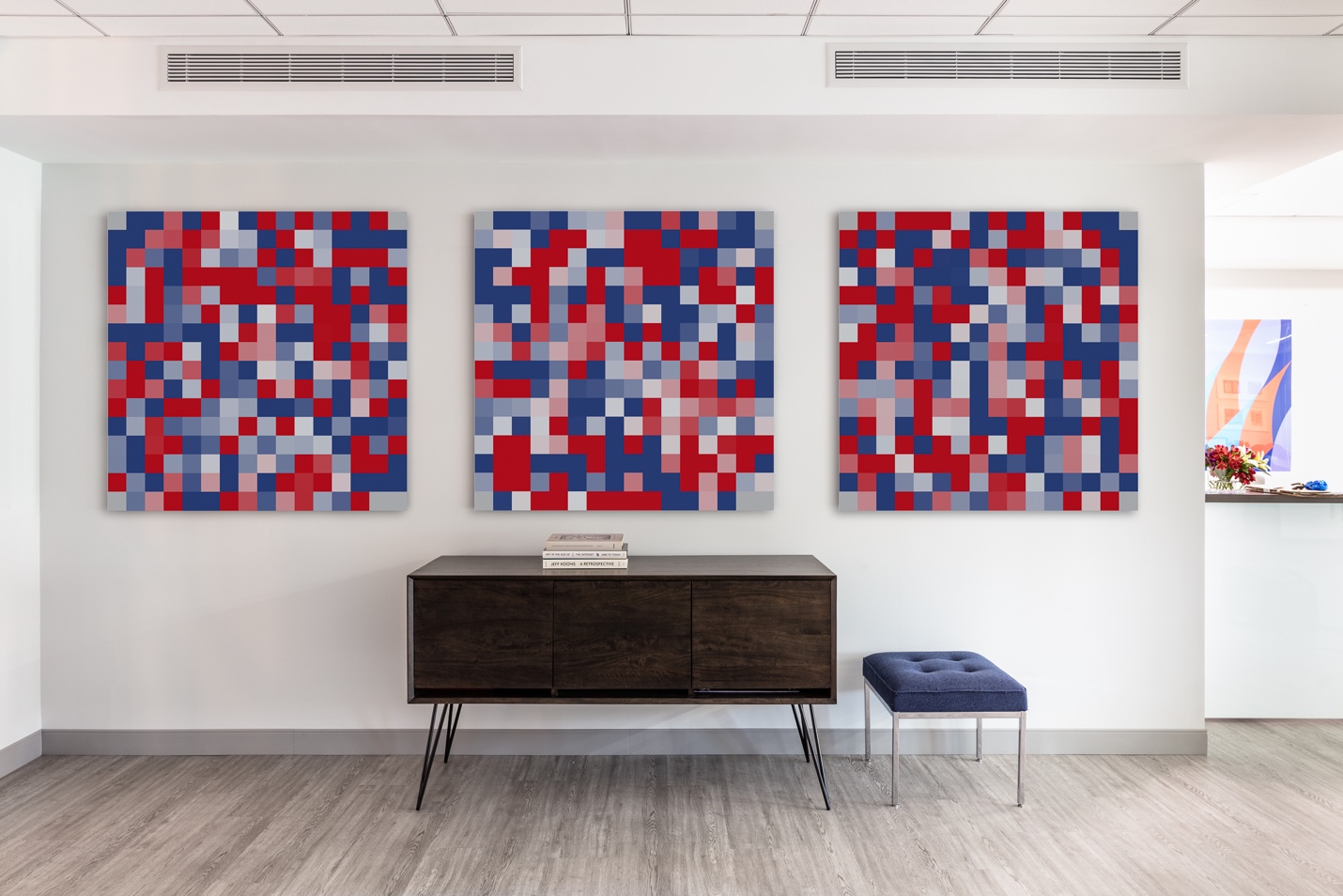
AME: Your series “Spectrum” investigates the frequency allocations of communications including radio, television, cellular, and satellite from South Africa, Egypt, the Philippines, New Zealand, and the United States. How was it to access this material that are all, I suppose, issued by their various governments, and how do the data sets vary?
JH: Most governments follow the US convention of representing different frequencies in a set of horizontal strips or bands and using various color schemes to denote different licensing categories and usage types. This information is readily available on government websites to ensure that broadcasters and other users of spectrum won’t inadvertently interfere with each other. The use of this convention to formalize the allocation of spectrum is, in my opinion, a remarkable intersection of technology, law, and graphic design elements. Speaking in strictly aesthetic terms, the consistency of the visualization style also allows for comparison and synergy despite the intrinsic cultural and economic differences particular to each country depicted. I have found this a very expansive and productive area to explore in my artwork.
AME: Within the same series, you created work for Meta. Clever, as the subject matter is suitable! How did this come about and how was it working with them?
JH: A friend who works for Meta introduced me to their inhouse art program. They were fantastic to work with. They identified an elevator lobby for which they wanted a commission and invited me to submit a proposal. I proposed an eight-panel site-specific work based on elements abstracted from the US frequency allocations piece I had previously produced. They approved it promptly and offered their expert art handling team in support of the installation. I was also grateful that they allowed me to visit the installation and have professional photographs taken, given the security requirements for their buildings.
AME: It is interesting that you chose Josef Albers’ “Homage to the Square” to serve as the basis for the color palette of “Lillian”—your series based on U.S. university ranking data. Clearly, as he was an integral figure in geometric abstraction—the first living artist to be exhibited in a solo show at the Museum of Modern Art—it connects with your own work that pushes the boundaries of abstraction, but also relates to the aesthetic of graphs ie. squares. Please speak about your relationship to this piece.
JH: I greatly admire Albers and have spent a lot of time looking at his work, particularly the “Formulation Articulation” series from 1972, as well as the various iterations on “Homage to the Square.” First, I just love the geometric rigor and dignified simplicity of these iconic bodies of work that he produced. Second, one of the themes associated with his practice is “perceptual ambiguities.” Albers addressed this through all of these intricate experiments around our color perception. That’s not what I’m doing, but I do feel that I’m playing with “perceptual ambiguity” when I strip the referents from a chart or visualization. There is, hopefully, a resulting sense of mystery. The abstraction seems to hint at some kind of meaning or systematic aspect, but you’re not sure what it is. Again, this is not exactly what Albers was doing but I feel inspired by his approach.
AME: Striking to me is also Albers’ importance in the U.S. educational system. Albers, a German emigré, first taught at the Bauhaus and was part of a group of artists who had taught there and came to the United States during the Second World War where they continued to both found schools and teach at leading institutions. They included László Moholy-Nagy, Mies van der Rohe, Walter Peterhans, Lyonel Feininger, and, of course, Anni Albers, Josef’s wife. In the U.S., Josef taught at Black Mountain College and headed Yale University’s Department of Design. For some time, U.S. institutions of higher learning were a safe haven for European intellectuals and after the GI bill, in 1944, many schools expanded to accommodate U.S. veterans who could attend for free. How is higher education in the U.S. a different place, and how is it similar to during Albers’ lifetime?
JH: I attended Yale for graduate school and that is where I was really introduced to Albers’ work, given his legacy there. I also had the opportunity to take one of the final years of the late Vincent Scully’s history of art course, which was extremely interesting. I hesitate to comment on such a broad topic as changes in the US educational system since 1944, but I wonder whether it might be the case that we are more obsessed with pure theory in the arts and humanities and less concerned with practice than was the case in Albers’ day. He was, after all, not just a theorist but an immensely successful and influential practicing artist, yet he made himself available for generations of students as a teacher and mentor, by all accounts.
AME: Is “Lillian” a critique of university ranking systems? After working with the rankings, what about them might be misleading to their viewers?
JH: I don’t take university ranking systems that seriously, but “Lillian” is not really intended as a critique of such rankings. Perhaps I’m poking mild fun at how much the rankings seem to bounce around from year to year – it’s hard to believe that the actual relative quality of universities is changing that frequently so presumably this is an artifact of some set of arbitrary criteria for the rankings. Mainly I loved the formal qualities of how the rankings were illustrated as a kind of time series, and thought it was capable of being “sampled” for a set of abstractions. It’s up to the viewer to determine whether they think the result is attractive or interesting.

AME: Why is it important, or interesting, to bring statistical data into art form?
JH: We live in a world populated by assets that are either tangible or intangible. Intangible assets are characteristic of information-based economies and include data, software, intellectual property, and various kinds of digital assets. Very talented people have been hard at work on art that represents tangible things in the world for centuries, maybe for millennia. It’s hard, not impossible, but challenging to make progress there, I think. But by contrast, the artistic exploration of data and other kinds of intangible assets is in its early stages, in my opinion, and presents many opportunities to explore fresh ground. I find it exciting to seek new subject matter for art in areas that would have been inexplicable to earlier generations, such as cell phone frequency allocations. In so doing, I think we also arrive at interesting questions about the dividing line between representation and abstraction. We generally agree, I think, that the representation of a tangible asset is representational art, but is the representation of an intangible asset, for example through a data visualization, itself something representational or something abstract? This seems like a fun question to ask, and if you can simultaneously produce something that is enjoyable to look at and to contemplate, I think that is worth doing.