

Pat Lipsky, Color Next to Color
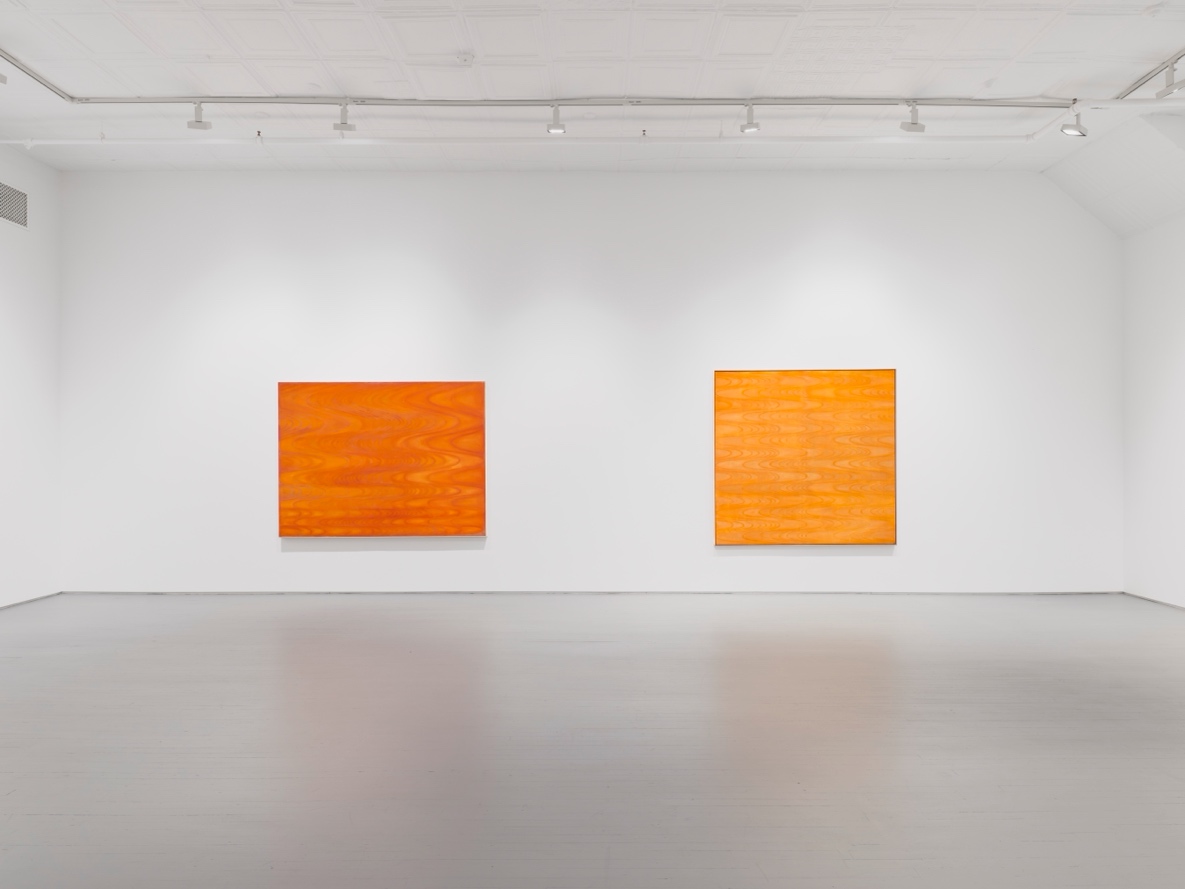
The morning of October 9 ushered in the brisk and invigorating chill of a belated New York City fall. It was on this day that I got to preview Pat Lipsky’s Color Next to Color, a show that energizes and revitalizes viewers’ field of vision. The show contains new works created between 2024-2025 alongside earlier works, which include a self-portrait from 1958 and selections between 1968—1971. Color Next to Color opens alongside the release of the artist’s memoir, Brightening Glance: Recollections of a New York Painter (University of Iowa Press). Outside of Self Portrait (1958)—an early demonstration of Lipsky’s interest in contrast, where she uses the background of the portrait to pick up the shadow of the self in the foreground—the selections are emblematic of her commitment to abstraction and the concept of color.
In the Turing series, named after mathematician and early computer scientist Alan Turing, we can see Lipsky’s love of mathematics and play with scale, working directly on canvas versus stretching it. She “had a strong background in math” and her “father was an electrical engineer.” Both works are made possible by the very arduous process of plotting curves.
Looking closely at Turing II (1968) and Turing III (1968) you can see “mathematical underpinning” of the works. The canvas is graphed, with many coordinated points—where horizontal and vertical lines meet. The mathematical structure at the base of these works engenders their movement and sway. Although Lipsky “knew somehow [she]had a gift in color,” mathematics always “gave [her] a scaffold to play with color.” At the preview she remarked, “I deal with enclosed space,” a concept her mentor Tony Smith meditated on throughout his art career; his use of architectural principles to interrogate how form can be used to typify and codify space.
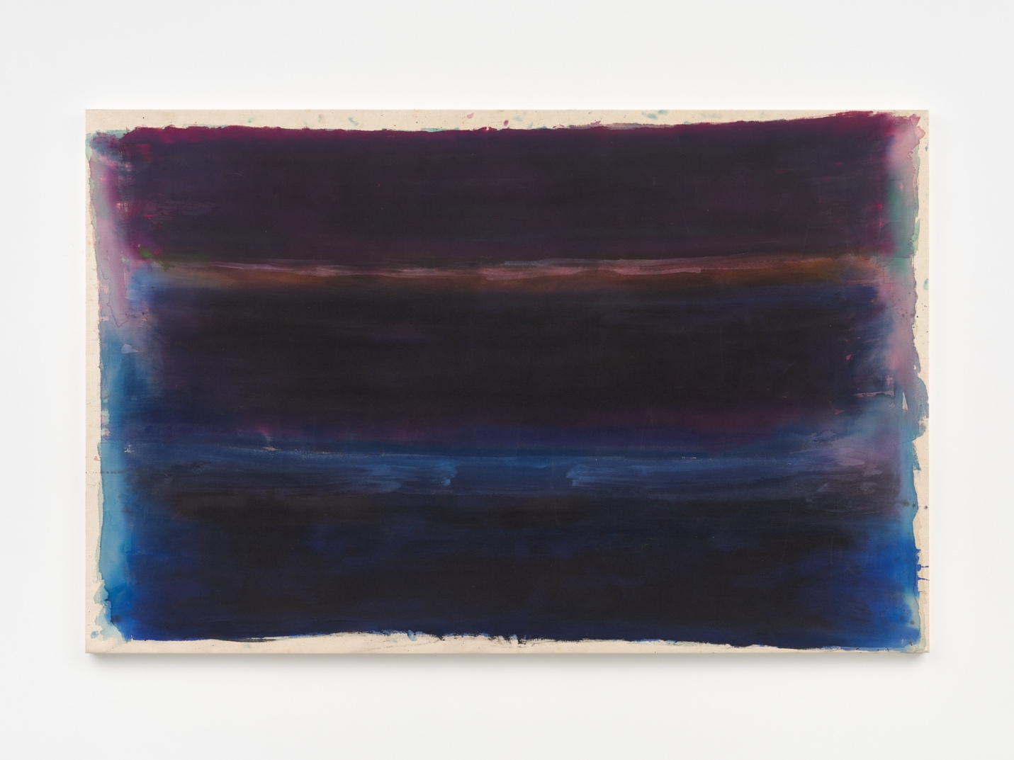
The way the border bleeds Winter (1971) is unlike other works in the collection. The work plays with the importance of the border and confinement in her work; it pushes up against this limitation. It makes sense that Lipsky struggled with “how to end the painting.” Chromatically, the work inverts the kaleidoscopic themes of decades-long contributions to Color Field painting. Mauve and cold blue are refracted through inky, shadowy colors. In this way, Winter pushes the conventions of her oeuvre to their limits.
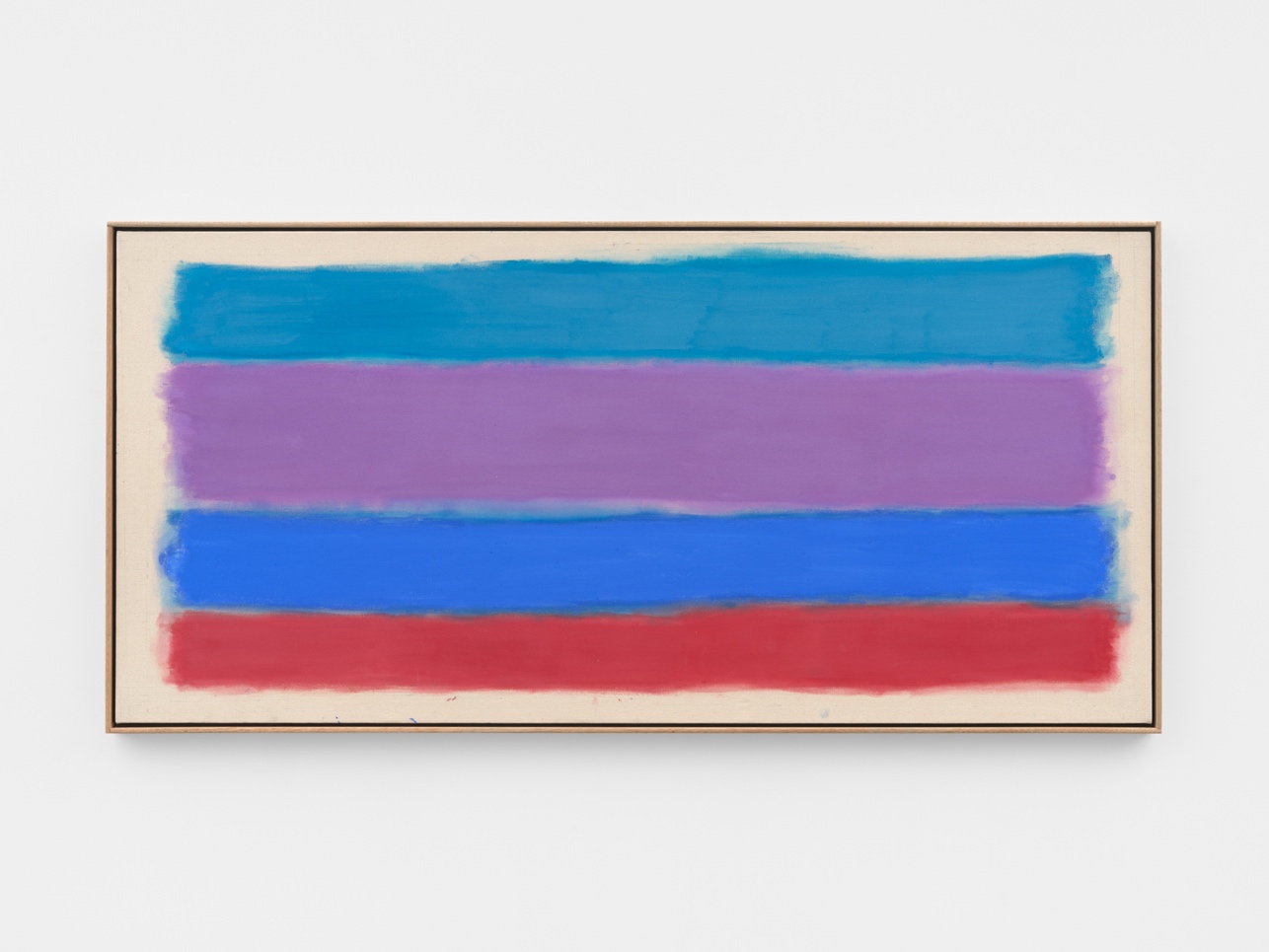
Now, more than ever, the 84-year-old painter is, as she explained during the preview, “interested in the relationship between two colors.” For example, right down to the color scheme, Dream (2024) was materialized out of a dream that Lipsky had, hence the title of the work. Dream crystallizes a color motif found throughout her work, that of the interplay between “warm blue and cold blue.” “Very taken with Manet’s color,” used in the work Boating (1874), Lipsky creates a reverie in contrast. Flight (2025) demonstrates her “interest in repetition.” It is a “one-shot” painting, created strictly from recreating Dream out of memory. Completed in one day, the work uses “a lot of water,” breaking from the tightly compacted structure of Dream and giving way to free-form synesthesia. It’s easy to get fixated on the space in between in a work like Flight.
In a time where our social order’s color theory insists on reproducing lifeless beige, oppressively fluorescent white, and listless sandy brown’s, Lipsky’s Color Next to Color is a much-needed reminder of the disruptive capacity of color.
Pat Lipsky Color Next to Color is on view at James Fuentes, 52 White Street, New York, until November 1, 2025